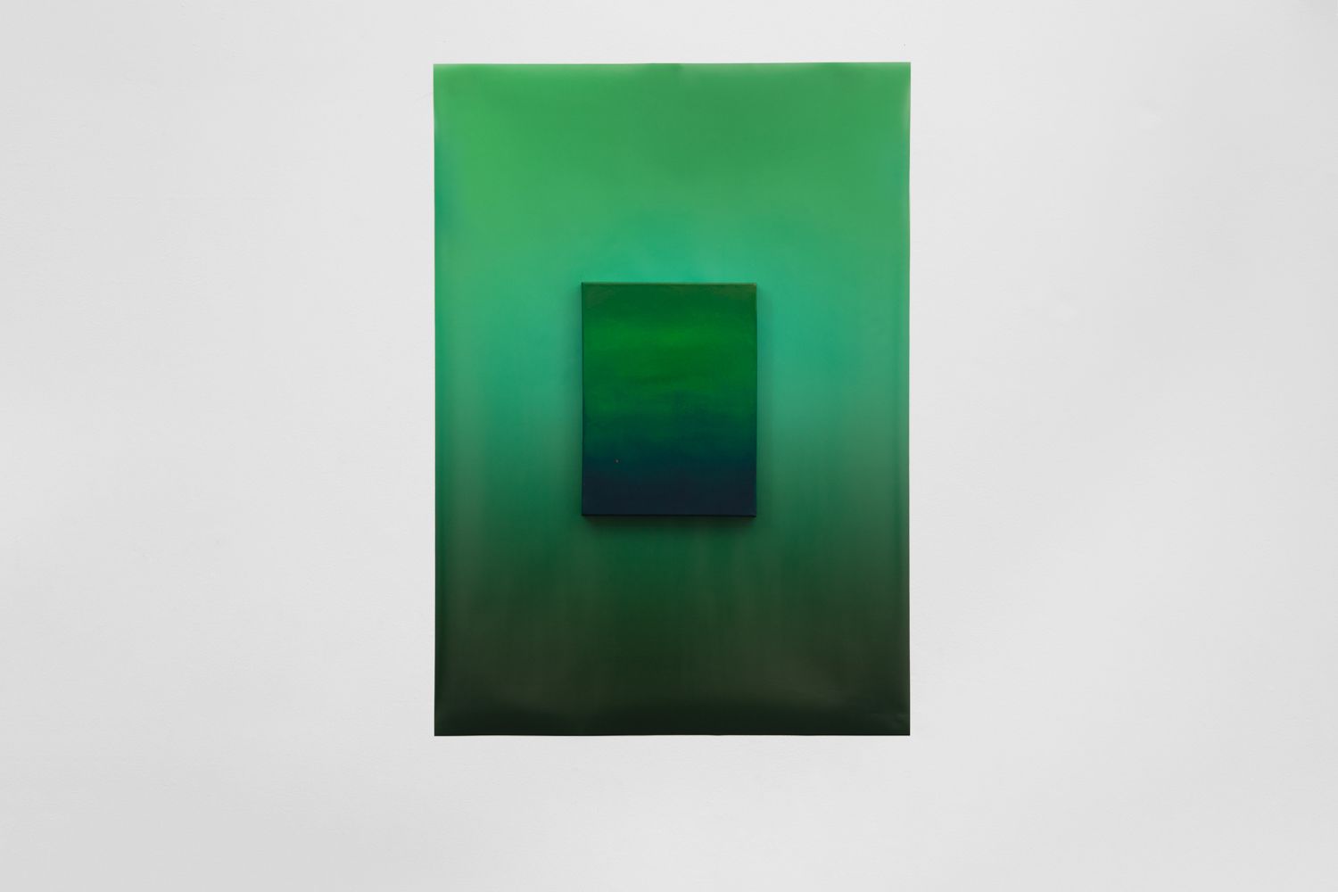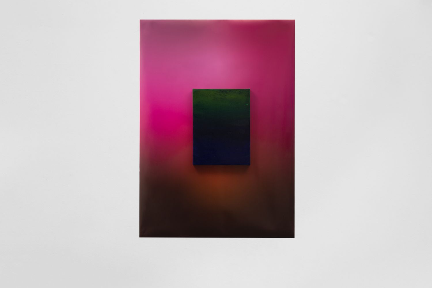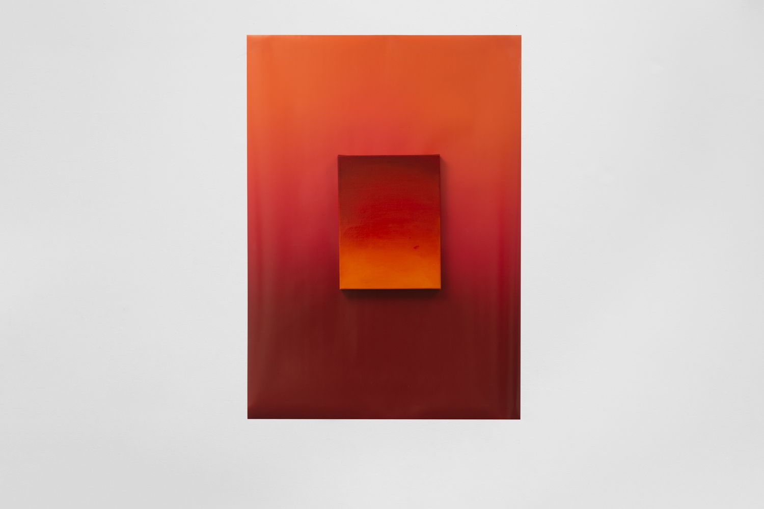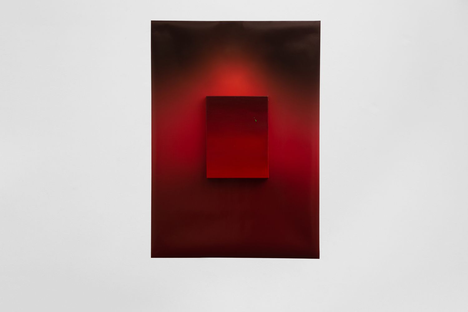

Standing In Red
Daisy Lewis-Toakley
8–25 May 2019
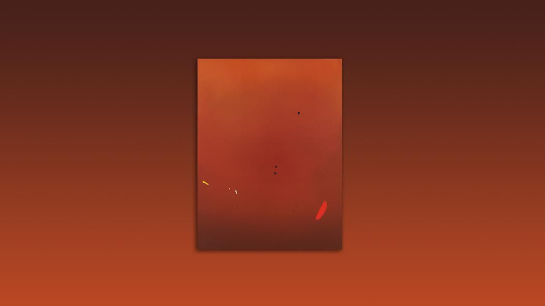
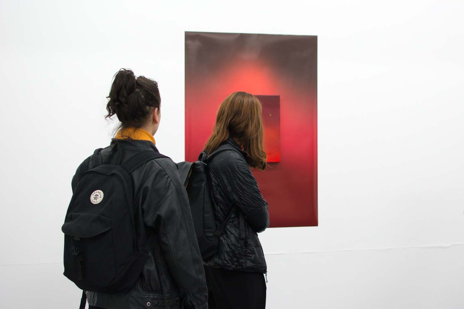
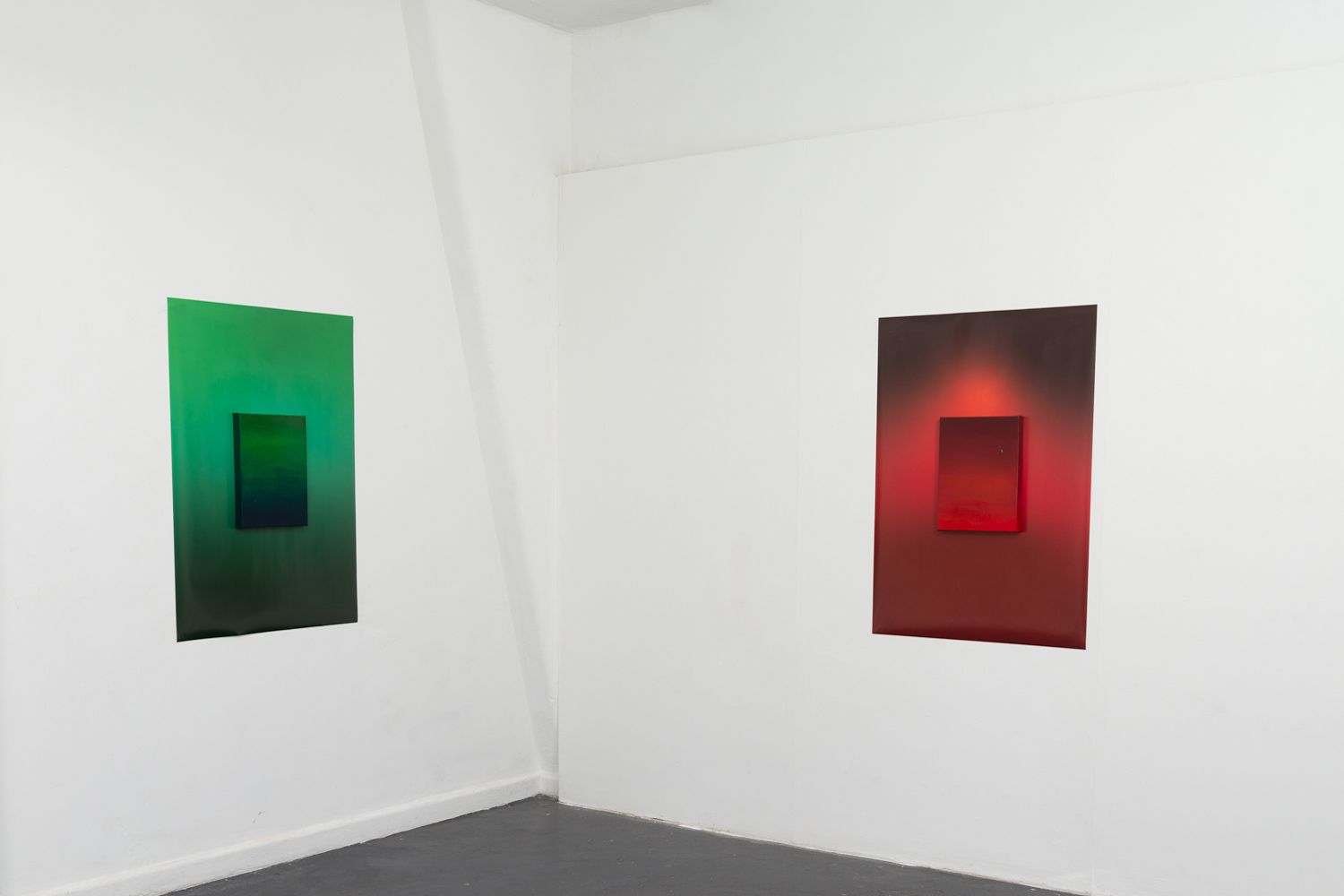
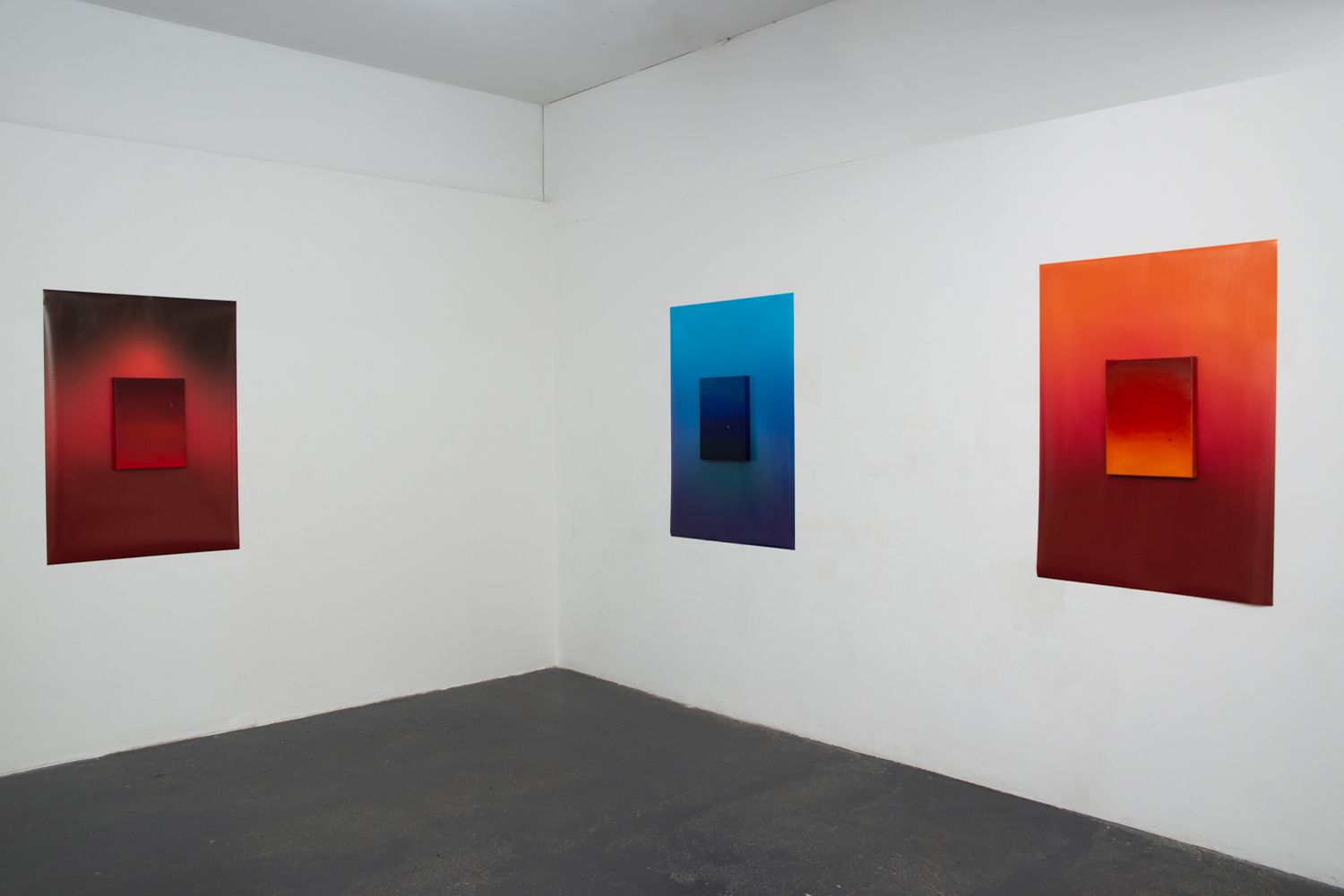
These works are not about colour, they are about everything else. Colour moves us to emotion, it connects us with the world around us through complex layers of cultural and contextual meaning. There is a relationship between the human body and a field of colour, a vibrancy that can extend beyond our physical body to the world around us. Neurons in our brain respond to colour, we are inherently connected to it. Colour can move us uniquely, and through this, form a mirror to the emotion of the viewer and their experience of the world.
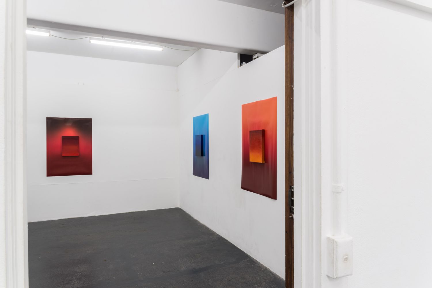
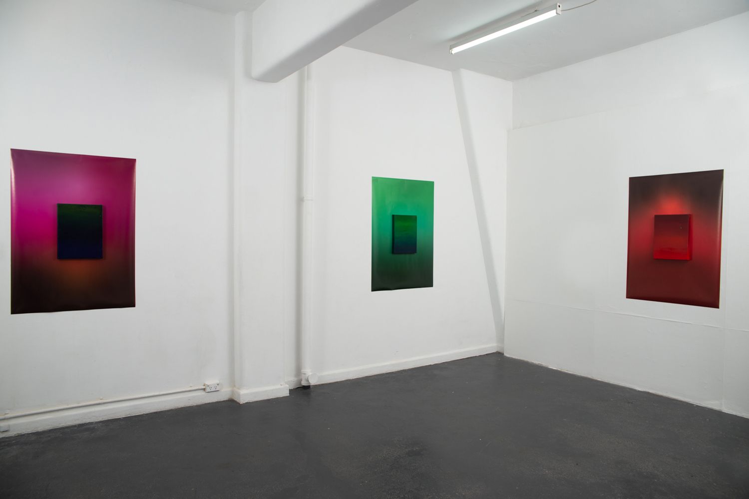
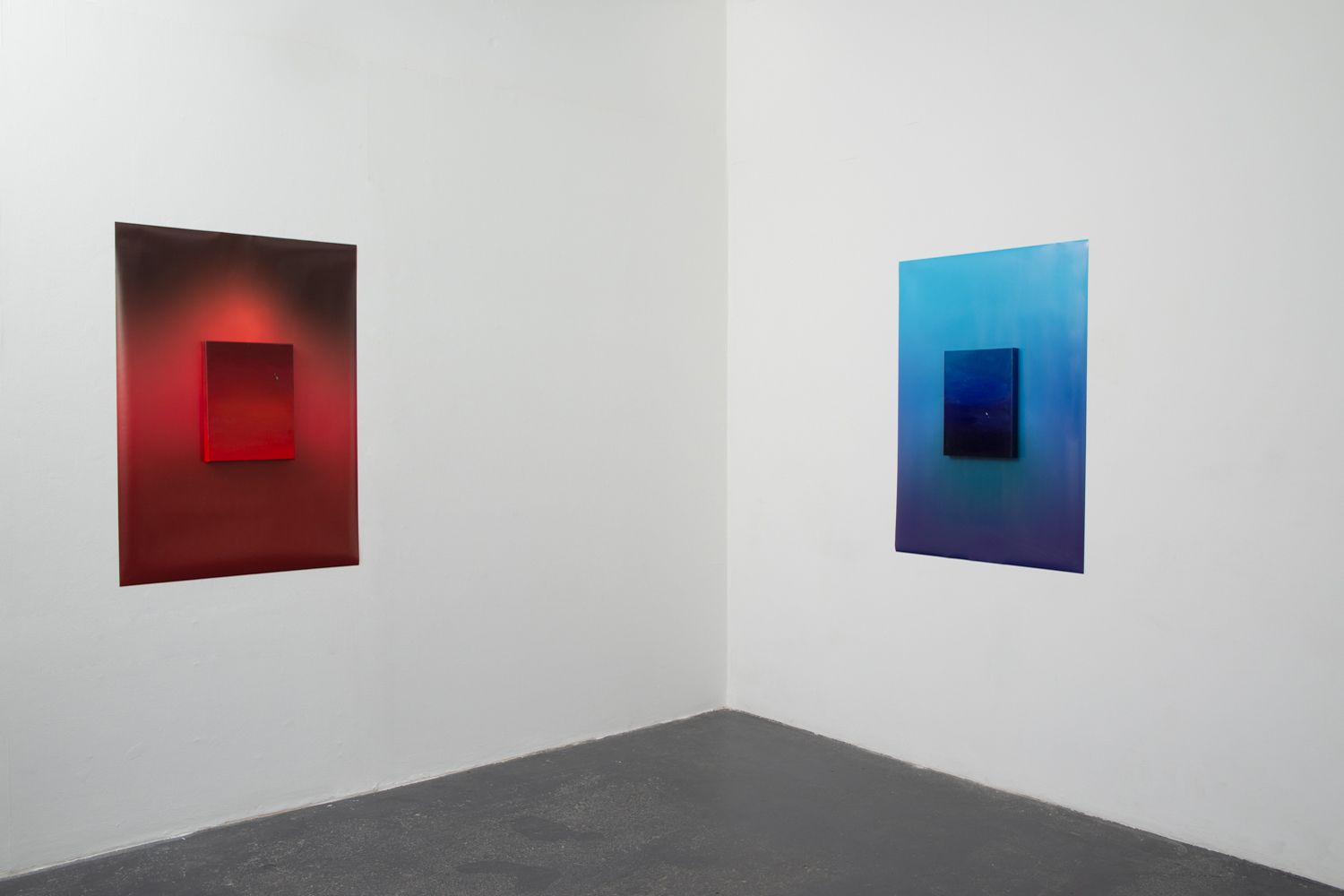
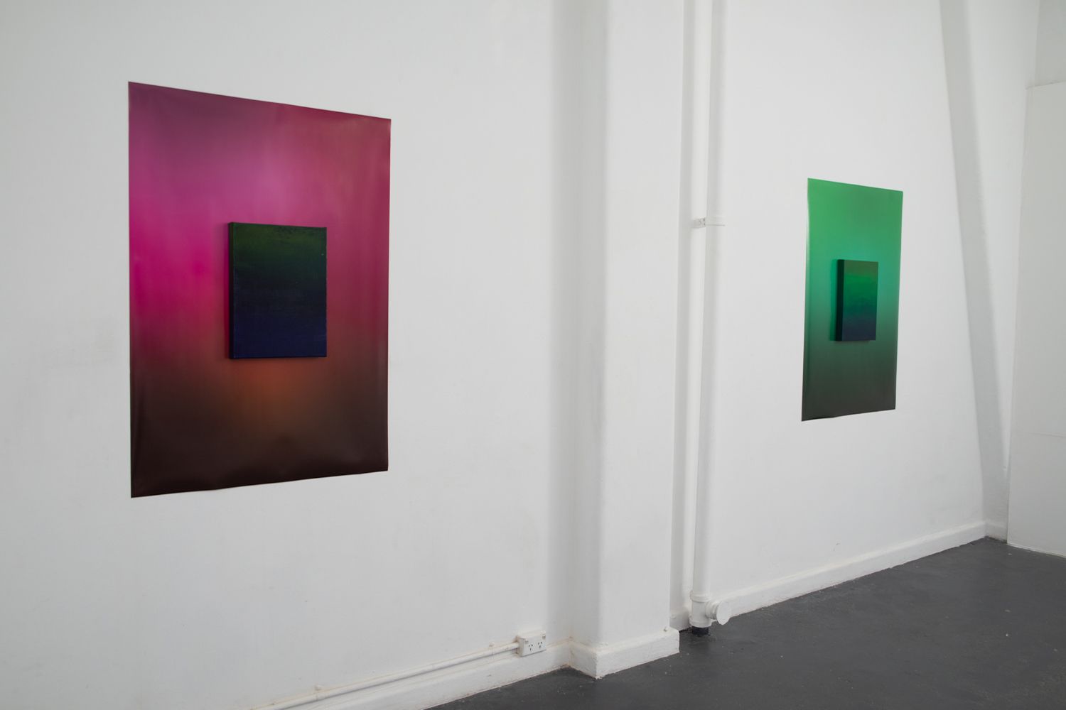
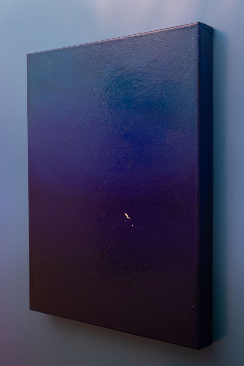
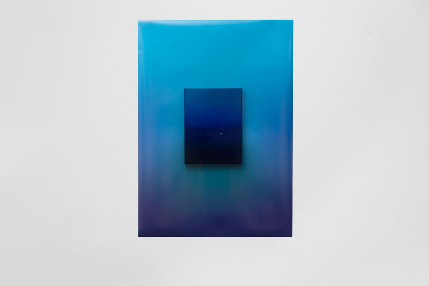
Technology brings us colour with a new vibrancy and clarity. The bold perfection of CMYK colour emboldens the flaws in the human comparison - paint. The closeness of digital and analogue colour highlights the minute detail, the flaw of the human application. It amplifies the quiet within the bold. Side by side we see the infinite imperfection that make us human.
Standing in Red
Ten years ago I first stood before the enveloping red of Barnett Newman’s, Vir Heroicus Sublimis and felt elation. I felt the same time-bending awe standing by the thunderous speaker in a lamp black club, inhaling ice-cold air at the greyscale peak of Cradle Mountain, I felt it in love, and when drenched in the piercing rapture of James Turrell’s light. These moments of sublime feel connected in my memory, bookmarked by colour.
The pursuit of elation through colour has a rich history. In social cultures, and in myself. Colour irrefutably has an emotional resonance, when feeling moved by colour we can imagine a vibration extending between our body and the field of pigment, an electric energy. Stand close in front of these works, allow the vibrant fields to wash over you. Let the feeling of space extend deep into the pigments. Look carefully, closely, and observe the difference between the digital print - the plastic ombre of pigment, and the painting. The latter is created through a process of layering thick glazes of fat and oil mixed with pigment. Dust, hair, and texture is trapped between the layers building rich colour and bookmarking imperfections during its growth. These imperfections hold a mirror to the human and highlight our flaws in turn, the mistakes are intimate. Behind them the perfect prints - CMYK pigments applied with digital precision, stand unemotional. Their gradients of colour in compliment or contrast to the hand applied oil paint. The comparison pulls us closer.
In Grade One, my teacher Mrs Reischek, asked my mum to come into school and speak with her because I was too bossy. Earlier that day I had sat next to a girl called Hannah, who was drawing a quintessential seven-year-old scene - a house (triangle on square), a tree (one branch), a quarter-sun in the corner (not with sunglasses on this occasion), ‘M’ birds and a dog. The ground was a single horizontal line. I was drawing a similar scene but my quarter-sun had alternating rays of bright orange and yellow, my ground was Faber-Castell fluoro green and I had clouds shaded grey with dark blue bottoms (I had just learned about shading). Hannah was drawing entirely in red. The house was red, the tree was red, the grass was red, the dog was red. Perplexed, I asked Hannah why she was drawing things in red that weren’t red, and she said ‘Because I like it.’ I was incensed. Grass wasn’t red, trees weren’t red and dogs certainly weren’t red. Her nonchalant likes and dislikes couldn’t change the truth of the world. I couldn’t believe her audacity and promptly told her so. Since I have learned the world can in fact, be drawn all in red. I imagine the simplicity of colours holding right and wrong functions as I saw them as a child, separate from the complex layers of contextual and cultural meaning we have been conditioned to apply to each shade. We cannot go back, and we ought not too. Through the force of colour we can see the world and ourselves.
These works are about everything colour gives us meaning to, and I invite you to consider quietly the internal tremble, fall, stumble and fault.
- Daisy Lewis-Toakley
Download accompanying PDF text


These works are not about colour, they are about everything else. Colour moves us to emotion, it connects us with the world around us through complex layers of cultural and contextual meaning.
Daisy Lewis-Toakley explores the relationship between the audience and contemporary art. Through installation, object, paint and light she develops conceptual art designed to form a collaborative relationship between the audience and the artwork. Daisy is passionate about the accessibility of contemporary art and developing works that are engaging and inclusive to different audiences. Daisy Lewis-Toakley is an emerging artist from Naarm/Melbourne, she studied Fine Art at RMIT University and has exhibited at galleries around Australia including Tinning Street Gallery, Studio 13 and as a finalist in the Churchie National Emerging Art Prize.
Related
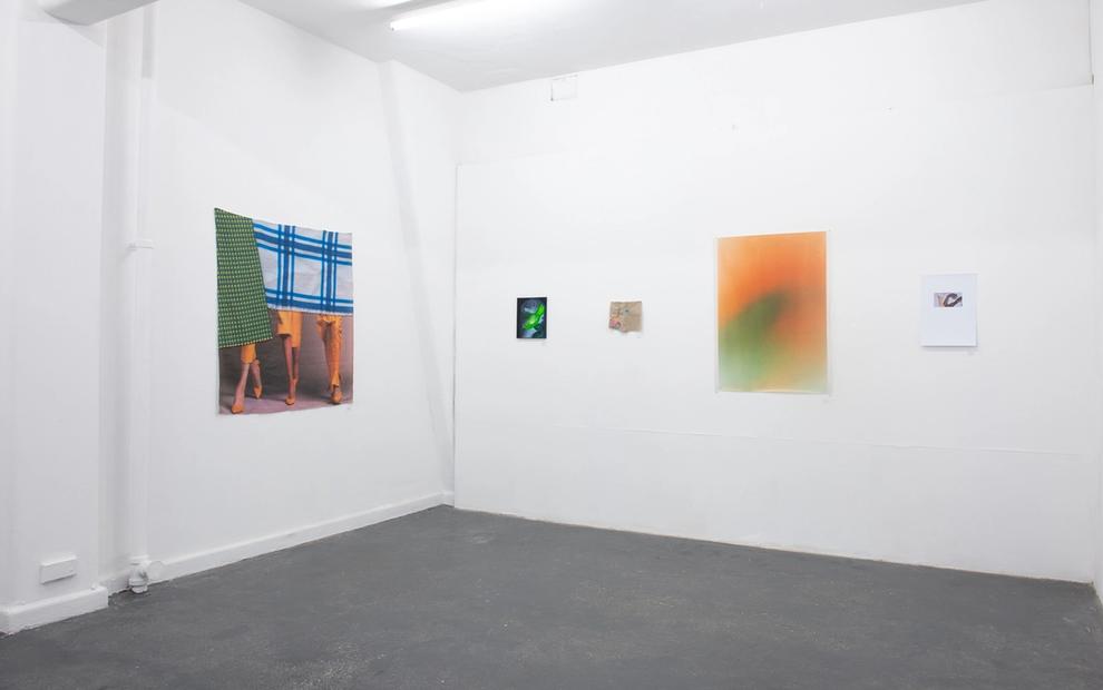
30 Oct–9 Nov 2019
B-SIDE 2019
Aaron Billings, Alex Walker, Cristal Johnson, Camila Galaz, Erin Hallyburton + Toy, Anna Dunnill, Britt Salt, Daniel Gawronski, Daisy Lewis-Toakley, Arini Byng, Billie Justice Thomson, Garth Howells, Jessie Turner, Levi Franco, Lachlan Stonehouse, Sandrine Deumier, Mia Middleton, Kirsty Macafee, Melanie Caple, Jordan Mitchell-Fletcher, Karen Casey, Paul Murphy, Lina Buck, Tyson Campbell, Steven Rhall, Tess King, Zainab Hikmet, Siying Zhou, Skye Malu Baker, Manisha Anjali, Haydn Allen, Georgia Anson, Olga Bennett, Seth Birchall, Phoebe Beard, Nicole Breedon, Kate Bohunnis, Tildy Davis, John Brooks, Mig Dann, Andrew Clapham, Lori Camarata, Lara Chamas, Lauren Dunn, Rachel Button, Ara Dolatian, MJ Flamiano, Jacquie Owers Gayst, Olive Guardiani, Emma Hamilton, Majed Fayad, Jessica Grilli, Stephanie Hosler, Erin Hallyburton, Zainab Hikmet, IchikawaEdward, Lucy Hughes, Abbra Kotlarczyk, Yvette James, Therese Keogh, Jackie De Lacy, Kaijern Koo, Shivanjani Lal, Anna May Kirk, Tess King, Lou Hubbard, Holly MacDonald, Lachy McKenzie, Kari Lee McInneny McRae, Anna McDermott, Tahlia McCuskey, Kirsty Macafee, Madeleine Minack, Christine McFetridge, Tamara Marrington, Josephine Mead, Brahmony McCrossin, Georgiy Margvelashvili, Jordan Mitchell-Fletcher, Sean Peoples, Sanja Pahoki, Lia Dewey Morgan, Betty Musgrove, Sophie Morrow, Katie Paine, Anatol Pitt, Olivia Mròz, Ruth O’Leary, Lekhena Porter, Steven Rhall, Cailtin Royce, Sara Retallick, Roberta Rich, Chunxiao Qu, Lisa Radford + Sam George, Marko Radosavljevic, Britt Salt, Aaron Christopher Rees, Rachel Schenberg, Jade Spokes, Tai Snaith, Ben Sheppard, Darcy Smith, Molly Rose Stephenson, Clare Steele, Jacqui Shelton, Leyla Stevens, Lizzy Simpson, Dell Stewart, Adam Stone, Jacqueline Stojanović, Madeleine Thornton-Smith, Camille Thomas, Lachlan Stonehouse, Masato Takasaka, Lesley Turnbull, Hana Vasak, Henry Trumble, Parkin Vatanajyankur, Leanne Waterhouse, Patrick Zaia, HeeJoon Youn, Grace Wood, Benjamin Woods, Zoë Bastin, Kawita Vatanajyankur
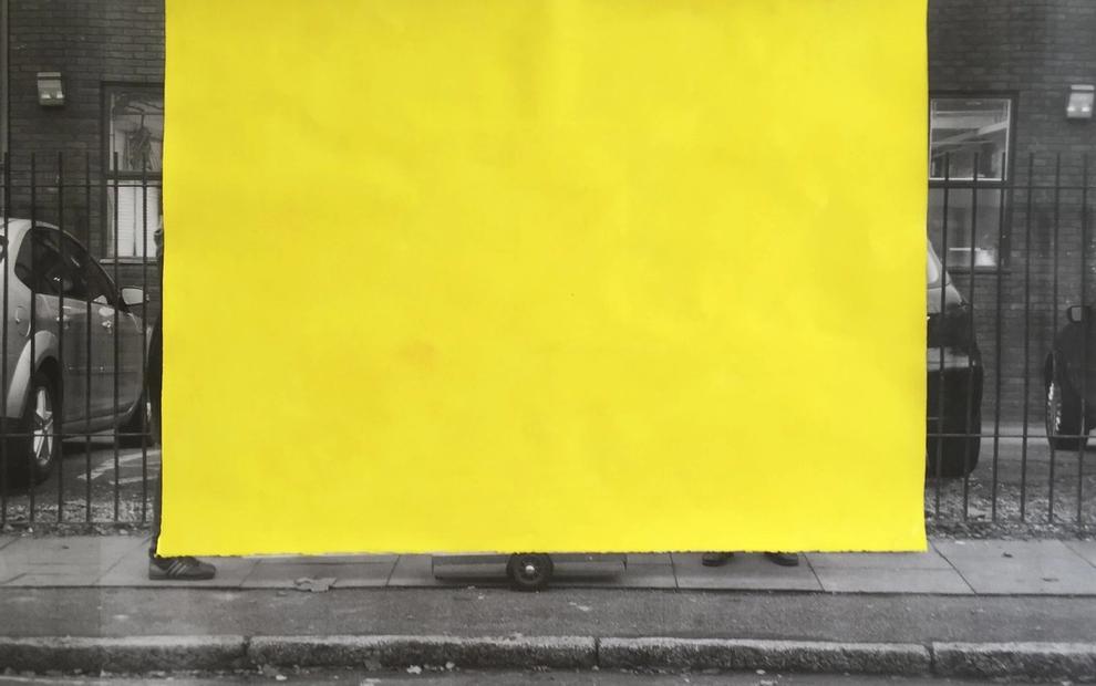
30 May–15 Jun 2019
Unfinished: Décor
Robert Mangion, Peter Burke, Damiano Bertoli, Elizabeth Newman, David Thomas
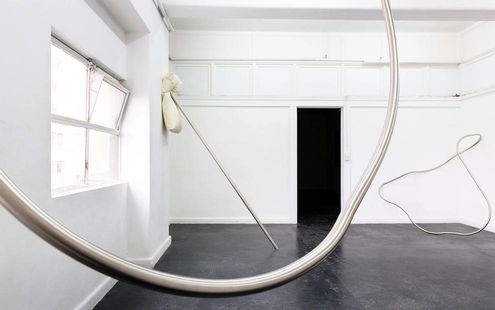
8–25 May 2019
With Each Little Death
Kate Bohunnis
